
|
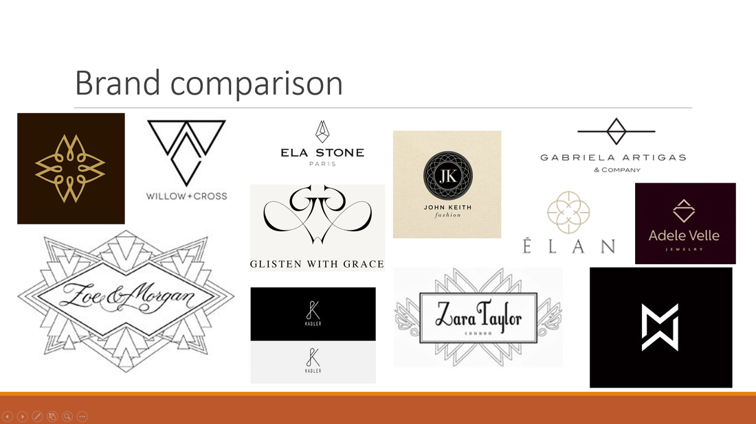
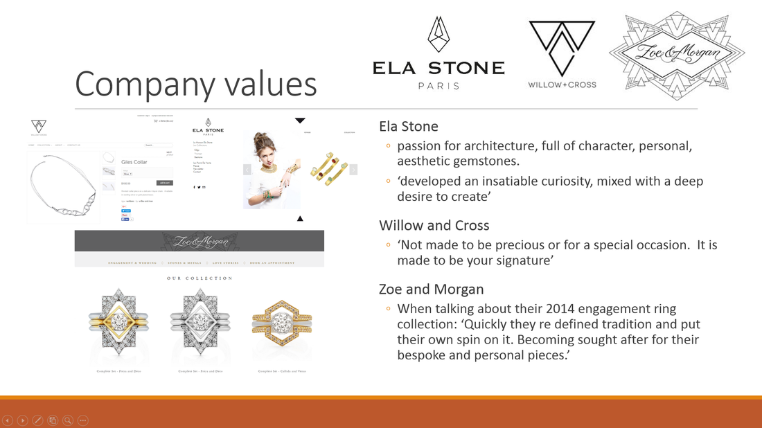
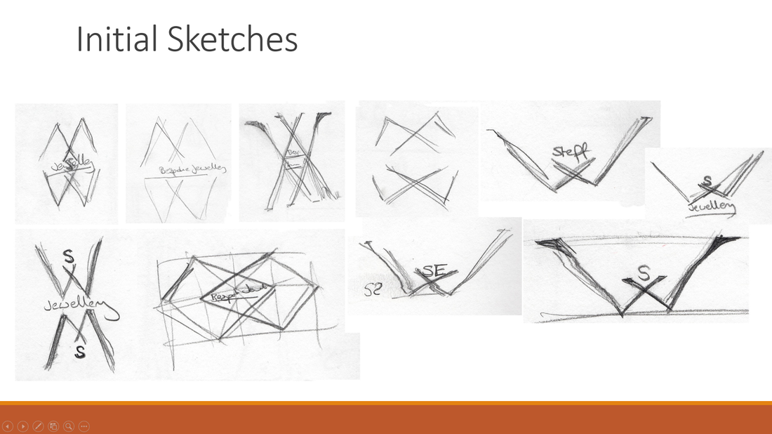
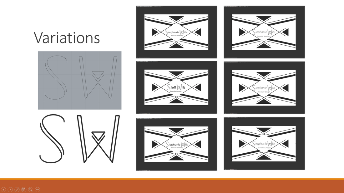
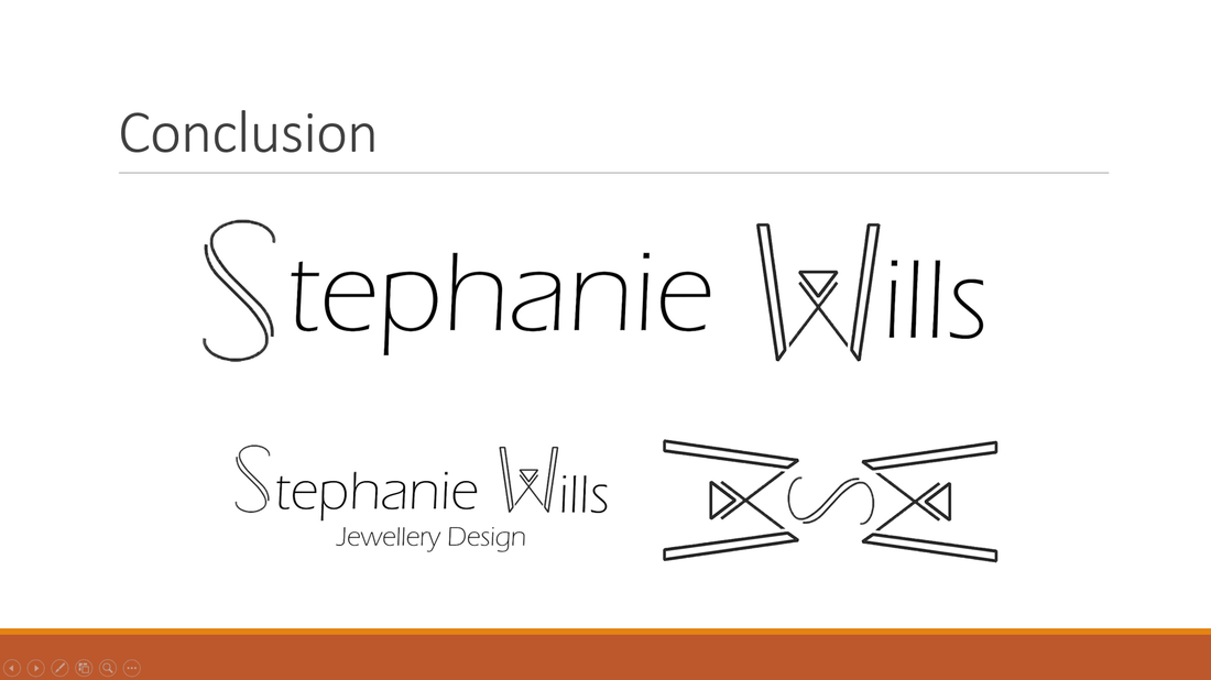
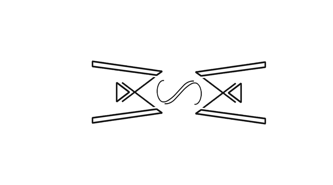
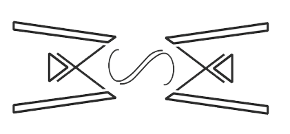
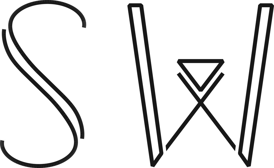
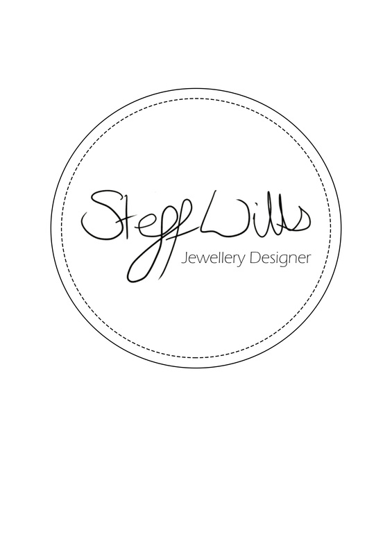
For those of you familiar with my website, you might remember my old logo was plain text running at the top of the page. I have since updated it in line with taking a module in business. 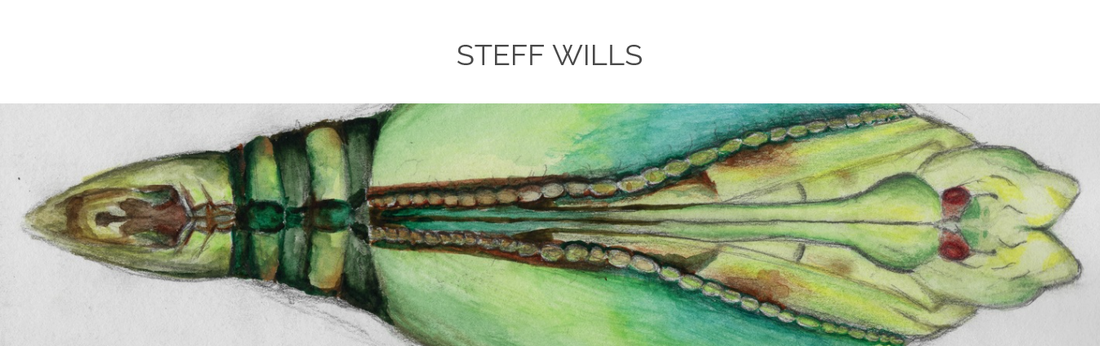 The past month on DFI we have dedicated our time to looking at business and our future as designers. For this we have been developing our brand image and designing logos. I had a very varied route to how I came about producing my logo. Previously I have used my signature as my logo but for this project I wanted to develop something completely new. So I started off by looking at images of jewellery brands that I liked and reasearched their values to find ones that I found most relatable. Here's a snapshot of my logo design mood board and the 3 designs I found most interesting.
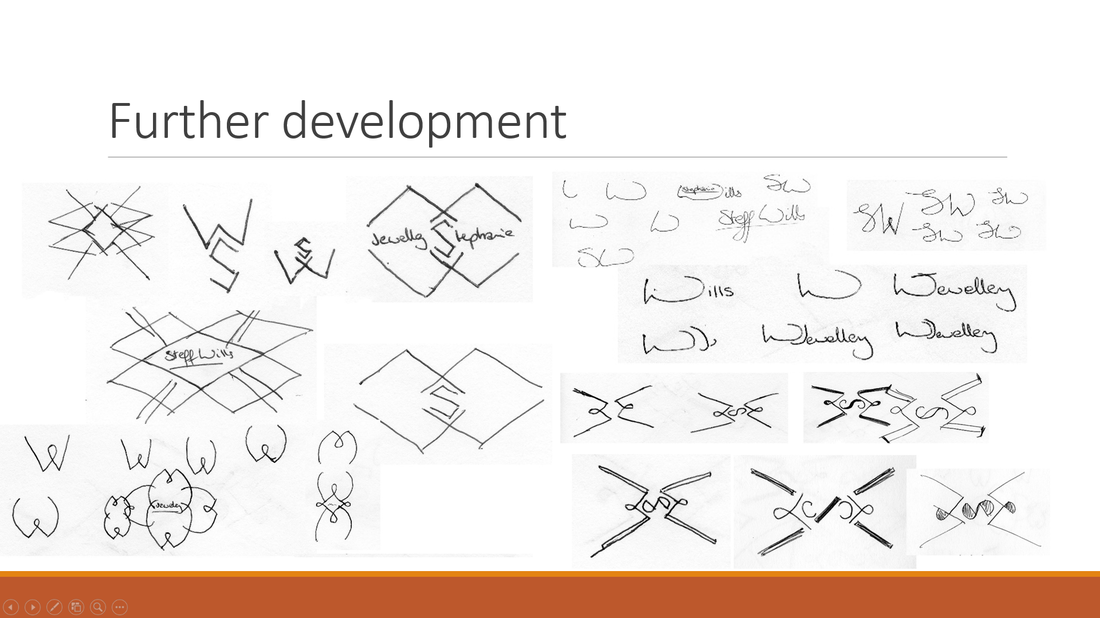
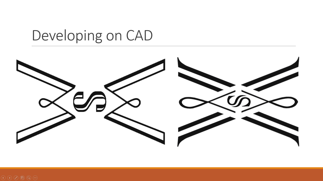
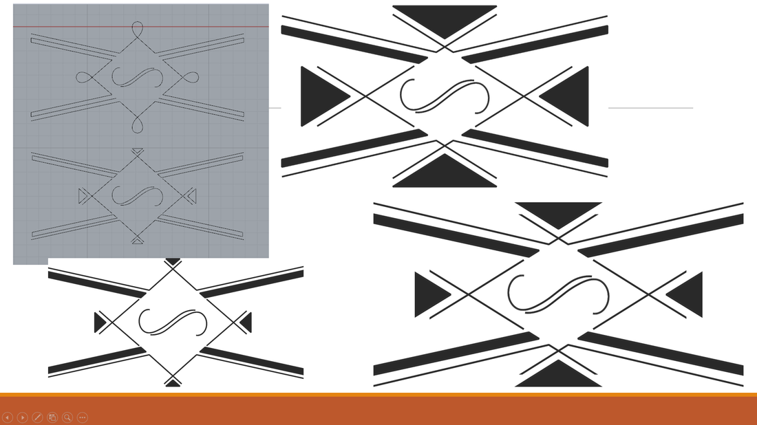
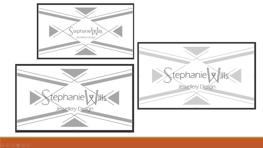
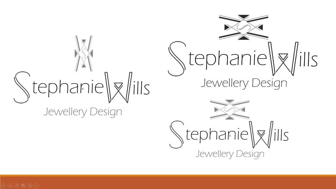
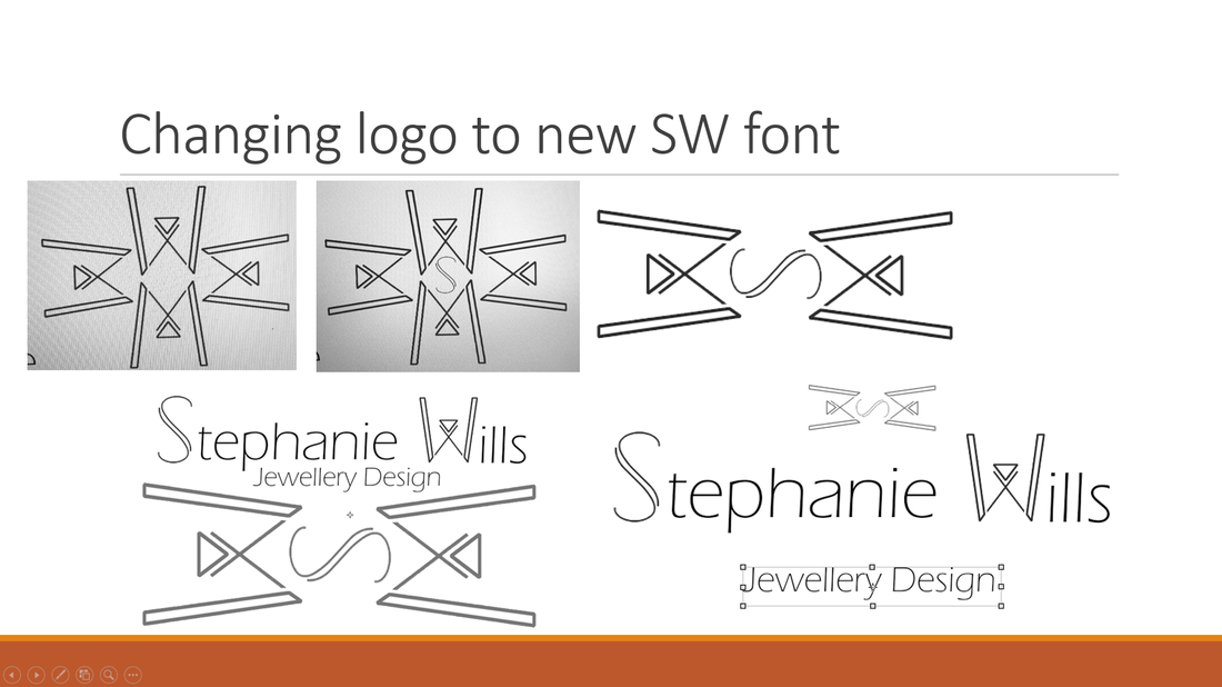
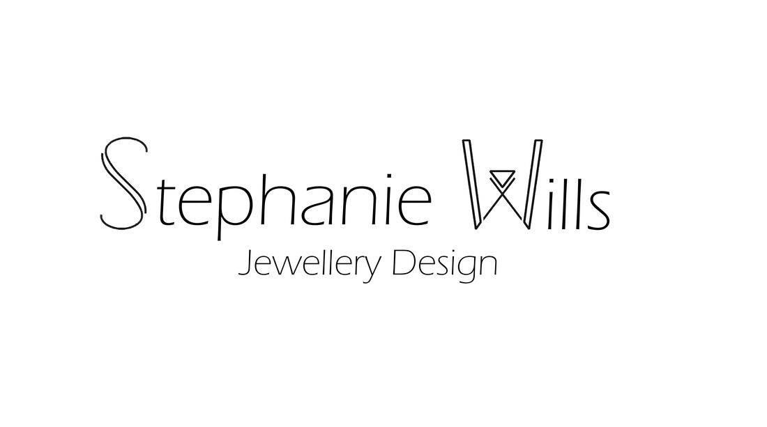
I wanted to represent the delicacy and intricacy in my design but also put across my interest in pattern. So I went through rigorous sketchbook development and came up with a variety of designs. I also experimented with fonts and line using Corel Draw but the final design was still very chunky. It didn't successfully capture the delicacy that I wanted it to. I collected all my research and logo designs and put together a presentation to show to my peers. After my presentation I got valuable feedback from the other students on Design For Industry. We decided that it was too chunky and they much preferred when I used my old logo which was my signature. I took this feedback on board and tried to work with my signature to create a more relaxed yet professional logo. This is what I came up with, 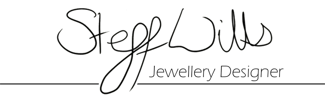 I have included this on my website but I am always open to feedback and comments on the designs. There is still lots more development that can be done. Please select your favorite design from the selection below and let me know your thoughts!
1 Comment
Ashleigh
16/2/2016 08:17:33 pm
Leave a Reply. |
AuthorSteff Wills: Archives
May 2017
Categories
All
|

 RSS Feed

